🤔 What is data-visualization.com ?
Data visualization is defined as the graphic representation of data.
This website is a collection of stunning dataviz project I've seen in my career as a dataviz practitioner. It's by no mean a complete list and is highly influenced by my taste 👨🍳.
But hopefully it should help you stand on the shoulders of giant next time you have a chart to build.
Dataviz-inspiration.com currently counts 427 projects by 176 different authors but is progressively growing. It aims to become the biggest source of quality chart images in the future, using a pinterest-kind layout that makes it pleasant to explore.
A glimpse of the viz showcased in dataviz-inspiration.com, presented in a pinterest style.
📖 Why I built this project
A few years ago I created the R graph gallery, a website providing hundreds of chart examples made with the R programming language. Soon I created the equivalent for python, d3.js and react. Those websites are now used by thousands of people every day but only help for solving technical issues.
This is why I created data-to-viz.com, a classification of chart types based on the data input format. It describes the main chart types, explains in what situation they're useful and what are their main associated caveats.
Once you know what kind of chart to draw and how to make it, one more crucial step is missing on the pipeline: How do you make your viz original, insightful and beautiful?
This is when you start googling in the quest of inspiration, browsing the work of other people who faced the same challenged before.
Being someone in love with data visualization for a while now, I've gathered my favorite snapshots in this portfolio and hope it will make your life easier next time you have something awesome to build.
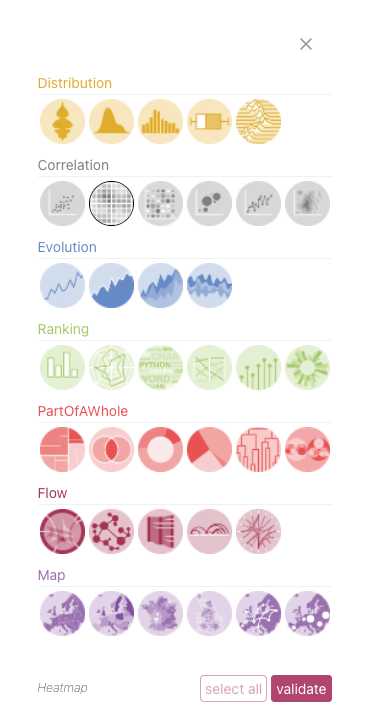
All viz projects are assigned to a chart type of the
data-to-viz classification. It makes it easy to target the viz you're looking for.
💛 The best sources for great charts
The viz projects displayed in this gallery are coming from many different places, and I often discover them on twitter. It is nonetheless possible to group them in a few categories.
Newspaper have became a continuous source of visuals, and it gets more true every day. Papers like the New York Time, the Financial Times, le Monde or die Zeit are constantly basing their studies on dataviz to better share the stories.
Some specialized magazines even base their editorial line on dataviz. It is the case of the Pudding that explains ideas using visual essays. If you love scrolly telling don't go now! You will most likely loose your day if you do 😀.
Dataviz competition and challenges are also some terrific source of nice visuals. I'm thinking for instance at the information is beautiful award or at the tidy tuesday challenge where I got a lot of this website entries.
But to be honest what I really love is browsing the home page of individual practitioners. Watching the work of dataviz superstars like Nadieh Bremer, Cédric Scherer, Maarten Lambrechts, Nathan Yau and a myriad of other people is truly a hobby for me and it taught me so much both in term of dataviz and general knowledge.
💪 Best examples for each chart type
I've tried to find examples for each chart type. However, it's interesting to realize that some chart types are very common (barplot, line chart) when some others are much lesser known (hierarchical edge bundling, ridgeline chart and many more.)
Here is an overview of the occurence of each chart type in the project. Types are grouped by family following the classification of data-to-viz.com.
Evolution and Ranking are the 2 main families, closely followed by Maps. Flows and Correlation are coming next.Distribution and Part of a whole are last, despite my love for the circle packing layout
A treemap showing how many chart of each kind is represented in dataviz-inspiration.com.
👋 Contribution | Contact | Future
Dataviz-inspiration.com is a work in progress! It does not have much content yet, and probably a ton of UX bugs. Please be tolerant and respectful when giving feedback!
That being said, I would love to hear from you! The best way (from far) is to open an issue on github, but you can also contact me on twitter or send me an email at yan.holtz.data@gmail.com.
You have a mind blowing dataviz project that should appear in this collection? Please let me know! 🙏🏻